5 Reasons Your Mobile Sales Are Suffering
AJ LaPorte#Commerce, #Design, #Mobile, #Responsive Design, #Design Advice

So you’ve launched your newly designed ecommerce store. Your online presence increases, and you notice orders are flowing in from your site. There’s just one problem: nearly all of these orders are coming from desktop users. As you peer into your website’s analytics, that’s when you notice it: there is a huge drop-off from mobile users on your site.
Now comes the main question: Why are mobile users failing to convert into customers on your site? Since statistics show that by 2017, over one fourth of e-commerce sales will be made via mobile, it’s crucial to address any issues you might have that are impeding mobile conversions.
If you’re encountering issues with your mobile sales, you might be overlooking some crucial aspects of mobile sales success. We’ve put together a list of five reasons you might not be getting the mobile sales you should be.
Pssst... Don’t worry, I’ll be listing some resources that can help you meet your mobile e-commerce goals at the end of the article.
1. Your website is not responsive
While a good design can be effective for converting users to customers, mobile users need to be able to effectively navigate your website.
According to a recent article by Google (or should I say Alphabet?), there has been a 29% increase in mobile conversions during the past year.
Enter Responsive Design
Responsive design consists of media queries, flexible columns (widths), and flexible images which automatically reformat a website for ideal viewing, no matter what size screen a person is using. Having an effective responsive design for your website can allow users, regardless of their device, to have a consistent and usable experience on your site, which in turn will allow it to become a mobile sales machine.
2. Your website loads too slowly
Have you ever tried to visit on a website on your phone, only to have your screen go dim because of your phone’s screen timeout settings? This is a perfect example of slow loading times.
As an example, let’s look at Amazon.com. Go ahead and open it up in a new tab on your browser. Notice the load speed? According to Pingdom, Amazon.com loaded in about 2.54 seconds (awesome sauce). Now go ahead and grab your cell phone and do the same thing. Notice a difference? I am almost certain you did. According to Mobitest, it took about 23.77 seconds to load up Amazon.com on a Galaxy S5. While Amazon might be able to get away with this due to its popularity, on a smaller-scale site, those 20 seconds can make the difference between a potential customer staying on the page and taking their business to a different site.
A recent research report from Microsoft concluded that the average attention span of users has dwindled since 2000. According to the report, we now have a shorter attention span than that of a goldfish. Yes, you read that correctly: your pal Admiral Shiny Fins has a longer attention span than most people. In the year 2000, the average user had an attention span of 12 seconds, while in 2013, the attention span was 8 seconds. Your buddy Goldy has a 9 second attention span (+1 for goldfish everywhere).
There is good news though: many options are available to help you increase your web site load times. Making use of services for image optimization, caching, and minifying your site’s files can help to increase your site’s speed and make sure that its load times can meet that 8 second attention span.
3. You don’t use proper sizing of fonts and tap targets
Making sure your site has properly sized elements for mobile users is something that is often overlooked. While having a sweet navigation on your site (even in a responsive site) may look cool, if the elements are too close together (or not large enough), users may end up tapping the wrong thing and get frustrated.
Google Developers has a nice small reference doc that helps address proper sizing of tap targets and using legible font sizes. While I would highly recommend reading through those resources (and the rest of the reference guide), here are some simple rules to follow:
- Make sure tap targets are at least 48 pixels tall and 48 pixels wide or more.
- You should have a space of 32 pixels surrounding your tap targets. This will ensure that when users select them, they won’t run the chance of accidentally selecting another target.
- A good default font size is 16 pixels (although this can vary depending on the font being used).
4. All your base are belong to advertisements
I believe we can all agree when I say that not a day goes without seeing at least one advertisement for something when browsing your favorite websites. While these can sometimes be great, since they help push recommended products or related services to customers for cross selling, they can also be overbearing and cause frustration amongst your mobile users.
A perfect example of this is the dreaded popover ad. For anyone who might be unfamiliar with a popover ad, here is a sample below (from popupdomination.com):
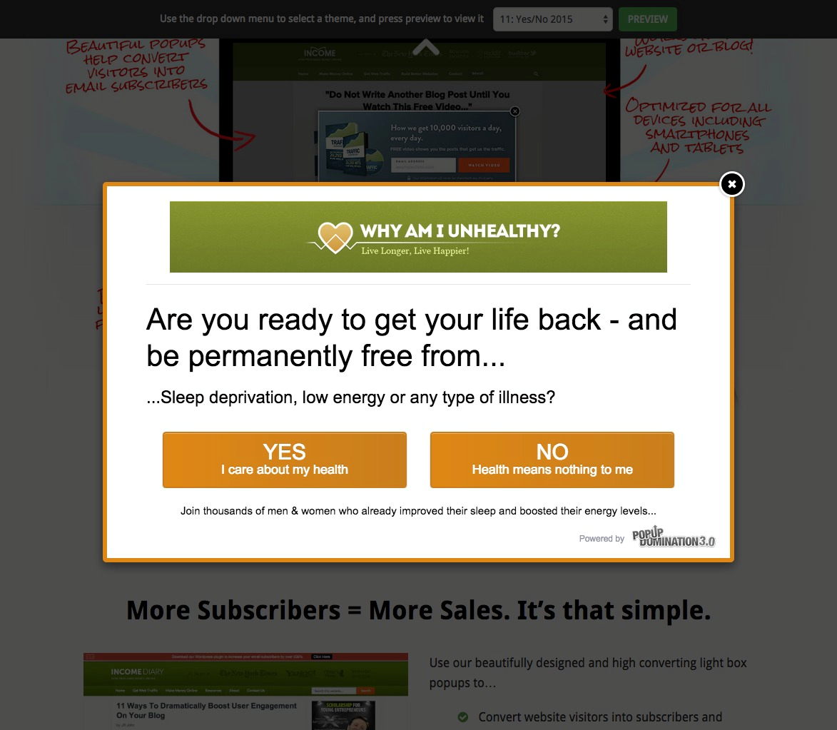
While this is a great attention getter on a desktop website and perfect for pushing important content to users, it may not be the best option for mobile users. Let’s take a look at how the same popover ad appears on mobile devices:
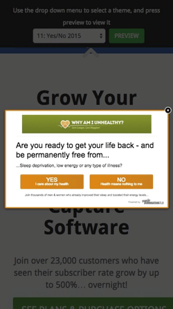
Yikes! While it gets the point across, it might hard to see the small close button in top right corner of the ad (The “X” is sized at 18 x 18 pixels, only slightly larger than the recommended text size mentioned above). While some popover implementations also allow users to close the window by clicking in the dark areas around the box, it’s impossible for mobile users to know whether or not this is an option.
Now, let's take a look at the text. I would have to say that it may be hard to read for some people. Because of this, the popover ad ends up being more of an annoyance than helpful information for mobile users. Combined with the difficulty of closing the ad, this may end up encouraging users to just leave the site rather than completing the intended call-to-action.
Be mindful of the types of advertisements you are pushing through to your customers. Choosing the appropriate ads for users based on the devices they are using to access your content can make the difference between a completed sale and a user who doesn’t bother viewing your site at all.
5. You don’t give the user a chance to breathe
Have you ever tried to carry as many grocery bags into the house as you can physically fit in your hands so you don’t have to make too many trips back and forth from your car (Don’t lie, we have all tried to compete in the World’s Strongest Grocery Bag Holder Olympics)? For those who don’t have a lot of groceries, this can be quite easy to do, but on the flipside, we’ve all had one of those trips where it seems like we bought half the store and our car is riding closer to ground because of it. While it might seem like a good idea to load our arms up with as much as we can possibly carry, we usually end up struggling to fit through the door without dropping anything.
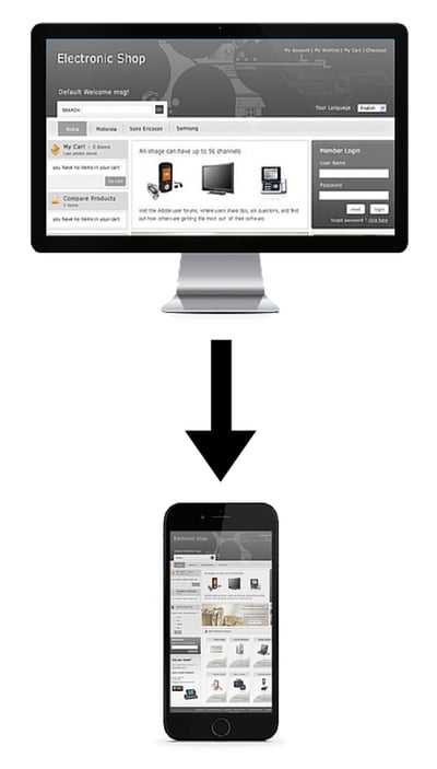
Mobile websites face a similar issue. Having a responsive, clean, and effective design can help users breathe and take it a little easy on the site. If you try to stuff all of the content from the desktop version of your site into a mobile view, you may end up cluttering the screen and causing the “visual exhaustion” that can come from trying to view too many things at once. Here’s an example of a non-responsive site that overwhelms the user when viewed on mobile:
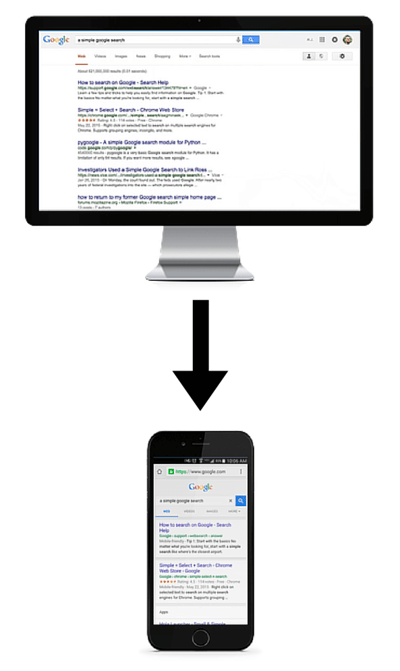
On the other hand, look at how a simple Google search results page (which already has a very minimal design when viewed on a desktop screen) is simplified further on mobile:
Ensuring that your users are able to take in your site’s content without being overwhelmed can help encourage them to stay on your site longer and make a purchase.
Creating Mobile Success
And there you have it! If your mobile site sales are suffering, it may benefit you to look at your site on a mobile device and see if you may be forgetting something that could be causing confusion for your mobile users and leading them to look somewhere else to get what they need.
Bonus Tip: Just when you think you may have created the best site ever and are free from any pain points or issues for mobile users, there is still more to do. Test, test, and test again, since users’ opinions, behaviors, and devices are constantly changing. Simple A/B testing using a service like Optimizely is a great way to get an idea of what works best. For more information, Optimizely has a great description of what A/B testing is and how it works.
Do you have any questions about responsive design, mobile usability, or how you can make sure your e-commerce site is providing the best experience for your users and encouraging them to make purchases rather than driving them away? Please contact us, and our Solutions Engineers can work with you to create not only a great mobile website, but an entire strategy for your digital success. If you have any other questions, or any tips of your own related to mobile e-commerce, please share them in the comments below. We’d love to hear from you!
Helpful resources
And now, here is the list of resources I promised earlier:
Responsive Design Frameworks
- Twitter Bootstrap: http://getbootstrap.com/
- Foundation: http://foundation.zurb.com/
- Skeleton: http://getskeleton.com/
Website Speed Tests and Optimizations
Websites
- Pingdom: http://tools.pingdom.com/fpt/
- Mobitest: http://mobitest.akamai.com/m/index.cgi
- Google PageSpeed Insights: https://developers.google.com/speed/pagespeed/insights/
Minification
- Minify: https://code.google.com/p/minify/
- W3 Total Cache (for WordPress Users): https://wordpress.org/plugins/w3-total-cache/
Files/Images
- SmallPDF (PDF Compresion): http://smallpdf.com/
- TinyPNG: https://tinypng.com/
- FILEminimizer Pictures [FREE] (best for JPGs): http://www.balesio.com/corporate/eng/download.php
A/B Testing
- Optimizely: https://www.optimizely.com/
- Unbounce: http://unbounce.com/
- Google Analytics Experiments: http://www.google.com/analytics/
Additional Resources:
- Microsoft Advertising: http://advertising.microsoft.com/en/home
- Think with Google: https://www.thinkwithgoogle.com/
Related Posts

Will Digital Agencies be Relevant in the Age of AI?
Rather than eliminating jobs, AI technologies will increase the productivity, quality, and value of the digital agencies that employ them.

Navigating an Optimizely CMS 12 Upgrade
Learn why an Optimizely CMS 12 upgrade needs detailed planning, efficient resource allocation, and an understanding of your organization's capabilities.
Results Matter.
We design creative digital solutions that grow your business, strengthen your brand and engage your audience. Our team blends creativity with insights, analytics and technology to deliver beauty, function, accessibility and most of all, ROI. Do you have a project you want to discuss?

Like what you read?
Subscribe to our blog "Diagram Views" for the latest trends in web design, inbound marketing and mobile strategy.