User Onboarding Process: Guiding Visitors Through Your Website
Britney Na#Design, #Design Advice

In the world of apps for smartphones and tablets, there’s a term for the process that introduces people to an app and teaches them how to use it. It's called the user on-boarding process. This process can take a variety of forms: from welcome screens that display the first time an app is launched to step-by-step tutorials demonstrating an app’s features, and to service sign up pages.
But what is the user on-boarding process? You can think of it as an app that's trying to make a good first impression. The goal of this process is, at the least, to introduce important, new features and help users become comfortable using the app as soon as possible. At best, the app wants to create a lasting first impression so that users remember and want to keep coming back to. When you compete with so many similar apps, that first time the user opens may be the only chance you get with the user.
Then what about for website user on-boarding? While designing the on-boarding process for websites may involve different visual and technical requirements, the principles remain the same. If a website makes this process difficult or unintuitive, people will quickly become frustrated and go to another website.
So how can website designers ensure that their users are able to easily use the websites they create? Here are a few tips on how to create a good website on-boarding process:
-
Tell a Story
Ideally, the user on-boarding flow of a website should be like telling a story, one that includes an introduction, a problem to be solved, and an eventual solution. Guiding users through this story will help them understand the purpose of a website and what they expect to do. This means that users shouldn't feel overwhelmed with the amount of personal information being asked the first time, and the sign-up process should be clear to users as to where they are in the process and what info they need to provide.
Imperfect Produce is a great example that tells an interesting story of how the buying ugly produce works. Through imagery, infographics, and words, the site introduces the concept of buying ugly produce, focuses on the positive impacts we can create, and convinces that signing up for their delivery system is not just about getting food delivered, but about being part of a greater movement to change society.

Imperfect Produce Homepage -
Provide Contextual Help
In addition to clearly defining a site’s information architecture, it is a good idea to provide users with a visual indication of where they are within a site and what they should do next. This can include using unique color schemes for different sections of a site or providing clear calls-to-action (CTAs) that show what steps can be taken next. This concept is known as information scent, and it is used to help users intuitively understand how to use a site.
In addition to information scent, the visual design of a site can provide users with a great deal of contextual clues. A site that is cluttered with extraneous information can lead to confusion, so it is best to remove anything that is not essential, and use spacing to dictate the pace at which users experience the site. A site that is designed with this experience in mind can make all the difference between user frustration and satisfaction.
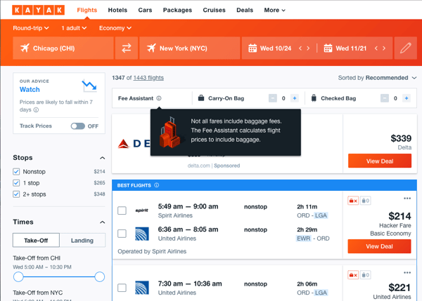
Kayak displays a popup window with detailed information for any content with the  icon next to it.
 -
Make it Personal
With the huge number of sites available on the internet, it’s important to differentiate yourself from the other sites people might visit when looking to find information or complete a task. How can you encourage people to not only use your site, but keep coming back for more? While the content of your site is important, making the experience personal and focusing on a user’s journey through your site is what will differentiate you from other sites and encourage people to return. Utilizing content personalization is one way to add this personal touch, but it can also be accomplished simply through understanding what users want to accomplish and guiding them toward achieving their goals.
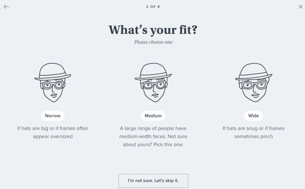
Warby Parker has an easy-to-follow and personalized eyeglasses section process based on what the user prefers. -
Use Wayfinding
One way to reduce user frustration is to design a site’s navigation in a way that clearly indicates the paths that users should take when completing the tasks they want to accomplish. This is called, wayfinding, and it can include clearly defined navigation elements like section menus or breadcrumbs that show users exactly where each page fits into a site’s structure, giving them a clear indication of where they are, where they’ve been, and where they can go next. This type of easy-to-understand site navigation is essential for helping users learn.
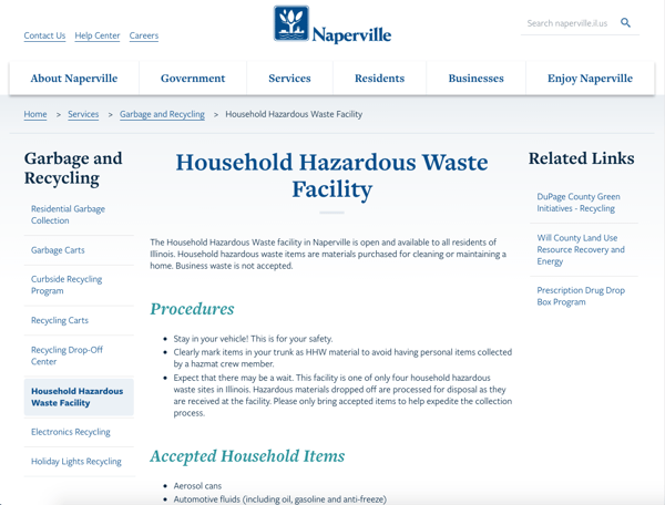
For a large website like the City of Naperville, the breadcrumb path and the section navigation are critical to helping users know where they are within a section of the website.
At Diagram, we emphasize user-centered design in the websites we create. In the Discovery step of the website design process, we work with a website’s users to determine how they use the site, the steps they follow when trying to find information or accomplish a task, what frustrations they experience, and how to help them achieve their goals. This gives us invaluable insights into how to create a design that incorporates the ideas described above to provide an ideal user experience.
Do you have any questions for us about user experience, on-boarding, discovery, or any other aspect of the design process? Please contact us, or feel free to share any questions or tips of your own in the comments below. We’d love to hear from you!
Related Posts

Alternatives to Twitter
We have identified some potential alternatives to Twitter that we believe are useful for marketers to spread their message and brand.

5 Tips for Quality Assurance ROI
ROI for software quality assurance can be improved exponentially if you follow our five steps. Click to read more.
Results Matter.
We design creative digital solutions that grow your business, strengthen your brand and engage your audience. Our team blends creativity with insights, analytics and technology to deliver beauty, function, accessibility and most of all, ROI. Do you have a project you want to discuss?

Like what you read?
Subscribe to our blog "Diagram Views" for the latest trends in web design, inbound marketing and mobile strategy.