Content Best Practices: Tips to Achieve a More Successful Page
Kendall Smith#Design, #Code, #Tutorials

While it’s important that your site is built with design standards and accessibility in mind, the content itself is the main focus and the ultimate reason people are there. Having a great overall design isn’t as powerful if the interior content leaves your audience feeling confused or like they’re missing some information.
With the reliance our society has on the internet, it’s crucial that content best practices and accessibility guidelines are followed for each and every page that’s created, even if your organization isn’t required to meet Section 508 standards. We've compiled a list of basic content-related tips that you should keep in mind when setting up your pages:
Use Tables Sparingly
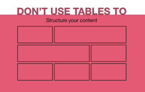
Using tables to space out text and images or to attain a different layout for your content in general is an outdated workaround that is no longer accepted on modern websites. Tables typically introduce a frustrating user experience on mobile devices, they can cause pages to load more slowly than the alternate solution, and they make it very difficult for screen readers to correctly translate the information to users with visual disabilities.
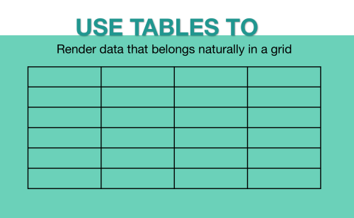
Tables should only be used when you’re comparing the same properties to a set of items or when the data naturally belongs in a grid. Don’t use tables to try to structure how your content appears on the page; instead, use CSS styles that have been defined by the designers on your site.
Format Text Appropriately
Headings
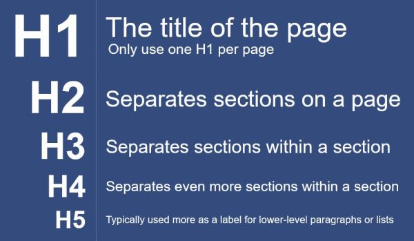
The global CSS on a site determines how headings should appear, but headings aren’t just there to make text look pretty. They define a page’s structure and divide the text into different sections so users can easily scan a page and find the information they’re looking for. H1 headings should only be used for the page title, and H2 headings should be used to break up different high-level sections on the page. Then, within each high-level section, H3 and H4 headings are used to separate the content into even further sub-sections.
Using headings in the proper hierarchy not only helps with search engine optimization (SEO), but it also ensures that people using screen readers will be able to navigate through a page correctly.
Emphasis
When trying to emphasize a certain point in your content, do you make the text bold, italicized or underlined? Confusion about the best way to emphasize text can lead to inconsistencies across your site and make things difficult to interpret, whether people are using screen readers or not. Here are some tips on when to use each type of emphasis:
- Bolding: This is a good way to make important text stand out, but using it too much can become overwhelming and cause it to lose its effectiveness. Never bold more than 10% of your text, and avoid bolding more than 10 words in a row.
- Italics: Italicized text can be difficult to read, especially when intermingled with other types of text. Try to limit italics to sourced text, such as the titles of a book, magazine, etc. or when you want to provide a brief disclaimer or special note.
- Underlining: With other text emphasis options available, such as bolding and italics, the need to underline text has become obsolete. Since underlined text can often be confused with a link, it is best to avoid using it altogether.
- ALL CAPS: Text presented in all caps may make your audience feel like they are being yelled at or just uncomfortable in general. Similar to italics, reading text in all caps can be difficult on the eyes. If you have an important message to emphasize, use bolding instead.
Avoid Inline Styles
Any time you make changes on a page-by-page basis to the font family, text size, background, or text color, you are incorporating inline styles into your content. Unfortunately, these changes can cause more than just unintentional display issues, they can also make your content inaccessible to some users with disabilities by overriding the global site styles.
If you need to format your content in a different way outside of the default display, use the styles from the site's global CSS that have been pre-defined by the designers. These can usually be referenced in the style guide or selected from a “styles” drop-down menu when editing content in the workarea. Custom styles always differ from site to site, but there are typically some general classes you can use to align images to the left/right, turn a link into a primary or secondary button, add or remove a margin, etc. Using the pre-defined CSS styles also allows any future updates (such as changing the color of the primary button) to be made across the entire site, rather than individually on a page-by-page basis.
Use Button Styles Correctly
If you’re using buttons in your content, it's important to know the difference between the primary and secondary button styles.

Primary buttons should be used for the action-related items, such as signing up for a newsletter, paying a bill, submitting a form, etc. They are typically the bolder and more noticeable button style available, so they grab the user’s attention first. Secondary buttons should be used to help provide more information about a particular subject or to direct the user to a related page in another section of the site (e.g. “Learn More” or “View the Event Schedule”).
Let’s say the main goal of your page is to get users to sign up for a service. In this case, you should use primary buttons to progress the user forward a step (e.g. “Submit the Form”) and use secondary buttons when the link either keeps them at the same step or regresses them backwards (e.g. “Reset the Form”).
Use Related Content to Support the Page's Message
The purpose of related content is to provide additional resources that support the main content’s topic and help avoid dead-end pages by allowing users to further their knowledge or view other related pages. Related content typically appears in the right and/or left sidebar on the page, and, depending on your site, you can display different types of content (e.g. styled link lists, event listings, calls to action, etc.). It’s important to remember that related content is just there for support, not to reference vital information that users may be directly looking for when coming to the page (e.g. important contact details, warnings or disclaimers, critical documents or links, etc.).
While related content is a helpful tool, too many of these blocks can become distracting and pull away from the focus of the page. It's recommended to not exceed more than three related items on a page and to only include content that is relevant and helpful to the page's message.
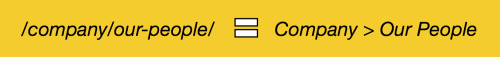
Structure Your Aliases Based on Page Hierarchy
Individual page aliases should let your audience know where the page lives in the site structure by showing each parent page as a level in the alias path. Each level also needs to match up with an actual page that exists on the site.
In scenarios where you want to use a shorter “vanity URL” for marketing purposes, 301 redirects can be set up so you still have the full alias path set as the default, but a shorter path will also lead to the same page. (Please see our blog on structuring URLs for more information.)
The Power Is In Your Hands
One thing that content authors and editors don’t always realize is how much power they have over their content and the website as a whole. Small decisions made when creating content can have far-reaching effects, so it’s important to make sure you are following content and accessibility guidelines, as well as best practices for SEO.
Luckily, you don’t have to go into the content creation process blind. By following the tips above and sticking to your organization’s style guide, you should be able to create content that looks good, provides a good experience for your site’s users, and is accessible to everyone, no matter what devices or tools they are using.
Do you have any questions about content creation, accessibility, or website testing? Do you want to know more about how Diagram’s team can help you make sure your site meets accessibility standards? Please contact us, and we’ll work with you to ensure that you have the tools to create content that meets the needs of every user. If you have any content best practice or accessibility tips of your own, please feel free to share them in the comments below. We’d love to hear from you!
Related Posts

Why Choose a CMS?
We look at the advantages that a Content Management System (CMS) can bring to your digital and content marketing strategy.

Why You Need an SEO Content Audit in your Migration Plan
Diagram's Allison Casey spills all her insider SEO tips on migrating your content the right way.
Results Matter.
We design creative digital solutions that grow your business, strengthen your brand and engage your audience. Our team blends creativity with insights, analytics and technology to deliver beauty, function, accessibility and most of all, ROI. Do you have a project you want to discuss?

Like what you read?
Subscribe to our blog "Diagram Views" for the latest trends in web design, inbound marketing and mobile strategy.