Industry Navigation: Two Approaches to IA
Britney Na Interaction Designer#Design, #Design Advice

When planning the information architecture of your website you must consider your users. Here we dive into two industries and their different considerations.
Any enterprise website will contain a lot of information, and determining the structure or architecture of that data is an important part of any web design project. But in addition to that information architecture, you’re going to want to consider how it is presented to the site’s visitors, and this means figuring out how to handle the site’s navigation, which defines how everything on the site is organized and labeled. Depending on the purpose of your site, there are several factors to take into account, so let’s look at the ways it can differ by comparing two of the types of industries that we’ve worked with in the past: healthcare and manufacturing.
Healthcare
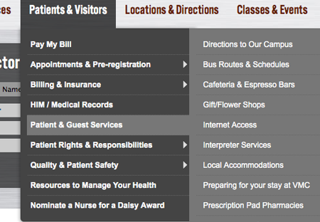
For an example of a healthcare company’s website, let’s consider what a hospital might want to have on their page. They’re going to want to provide some information about themselves, especially if they are promoting doctors who have received awards or highlighting recent news. They’ll also need to point users toward their facilities or services, helping them find the doctor or department that they need. They want their website to say, “This is who we are, and here’s where you can go to find more information.”

Manufacturing
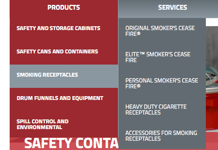
A company that makes and sells products will have a different focus, since as an e-commerce website, they want to put their products front and center, with the main function of the site being to sell those products to the site’s visitors. Any information about the company itself is less important, and may not even be included in the main navigation, instead being shifted to the utility navigation that usually resides in the site’s footer. For a manufacturing company, the website should say, “This is what we have to sell, and this is how you can purchase it from us.”

Different structures
As you can see, the approach to organizing the site’s information and how a user navigates through it is very different for these two industries, and will result in a completely different type of site map. Healthcare sites will want to break their information into several different categories and provide more navigation elements for users who are trying to find the information they need, but manufacturing sites will want to group information together, placing products into categories and subcategories that make sense to buyers.
Consider User Experience
A company has a familiarity with the information presented on their website, but in order to best serve their users, they should also be sure to do their best to determine what their users expect from the navigation of their site.
A manufacturer, especially with an e-commerce site, will want to keep things simple and easy to remember. Users need to feel secure that they know enough about the available products to make an informed decision, and that they can easily get more help should they need it. Clearly mapping the product or service categories is the first step in the navigation design. We’ve observed multiple times that the easier it is for users to understand where to look for what they want, the longer they stay on the site, and the more likely they are to come back.
On the other hand, a healthcare site (particularly a hospital) almost has to take an opposite approach, since such a wide variety of people might be visiting for any number of different reasons. While they might be looking for information about doctors or services, they might also need to determine what options they have to pay for services or how to handle insurance details, or even how to find driving directions or find out what is available in the cafeteria. In order to meet their needs, you’ll need to offer more information up front, trying to help them find how to get where they need to go on the site with minimal confusion.
Conclusion
Ultimately, the way a site’s navigation is handled is not just about organizing content. You’ll want to think about what your users want and how they behave when using your site, but you’ll also want to consider what business goals you want to focus on meeting. Keeping all this in mind when structuring your site’s navigation will help you figure out what works best for you, ensuring that you’re serving both your own needs and that of your users. Do you have any other tips on what types of navigation work best for your site, or questions about how to make sure you’ve got everything covered? Let us know in the comments below!
Related Posts
![3 CMS Platform Migration Considerations [Mini Episode]](https://www.wearediagram.com/hubfs/Diagram-Views-Unfiltered-Transparent-BG-All-Black%20small.png)
3 CMS Platform Migration Considerations [Mini Episode]
Diagram's Chris Osterhout shares three essential tips that your organization should consider when moving to another CMS platform.

What Does Umbraco 7 End of Life (EOL) Mean for Your Website?
Diagram's Chris Osterhout explores the details of Umbraco 7's end of life and what to consider when planning your CMS upgrade.
Results Matter.
We design creative digital solutions that grow your business, strengthen your brand and engage your audience. Our team blends creativity with insights, analytics and technology to deliver beauty, function, accessibility and most of all, ROI. Do you have a project you want to discuss?
Like what you read?
Subscribe to our blog "Diagram Views" for the latest trends in web design, inbound marketing and mobile strategy.
