
If you've spent any time at all using the interface of Google's Adwords tool, you know that, despite the amazing depth of options within the platform, it isn't well known for being the most user-friendly. This update to the user experience of AdWords, however, propels the platform forward lightyears both in terms of interface and functionality. What does the process look like? We grabbed some screen shots of their 5 step introduction to give you a heads up so you can decide if it's worth your time to try it out.
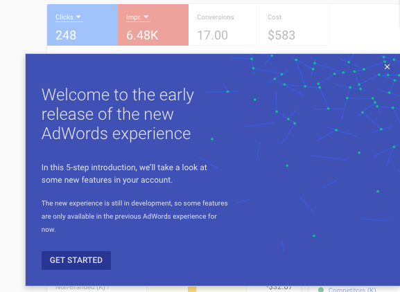
To start off, you'll be asked if you want to apply the new look and feel - but be aware - some of the functionality of the old interface is not yet available in the new preview. Google does their best to warn you of this in advance and to let you know you can always switch back to the old interface if you can't accomplish a certain task in the new.
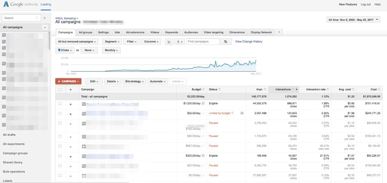
The old, familiar interface had lots of options but literally looked like the advanced version of a spreadsheet. The menus across the top and along the left made navigation to key elements a bit of a chore and instant display of key metrics were de-emphasized.
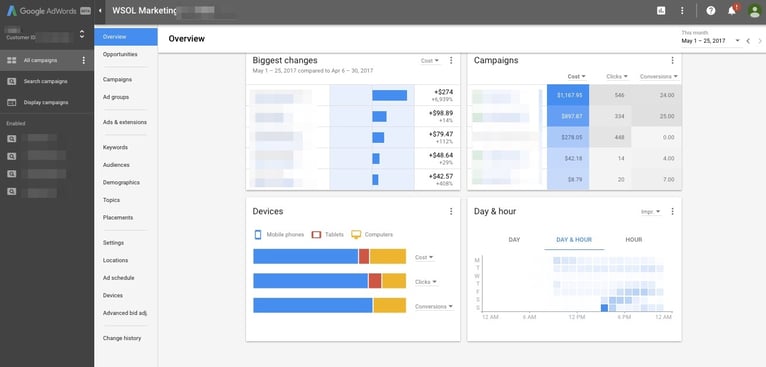
The new interface is more in line with the look and feel of modern "Twitter Bootstrap" inspired designs with excellent new high level visuals for performance of key metrics including heatmaps for active days and times of impressions and bubble charts for easily ascertaining where you stand against your competition.
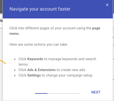
Once you select that you want to try out the new interface, you'll be shown around a bit. Like we mentioned, the first thing you'll notice is a change in the left hand navigation that cleans up the work space tremendously. You can quickly switch between overviews of campaigns and ad groups, and change the settings as needed.
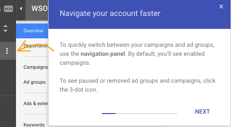
Expanding the left navigation reveals a more familier menu set with a new look and feel. Here is where you choose between existing and paused campaigns to make the changes and see the results.
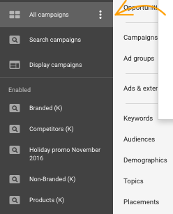
Again, the new interface adjusts to display the overview information of what ever campaign you select on the left, which is a nice feature. You can also select for the displayed information to change for each campaign to show keywords and ads directly, without having to spend a lot of clicks navigating from one campaign to another.
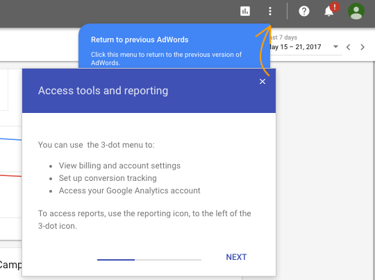
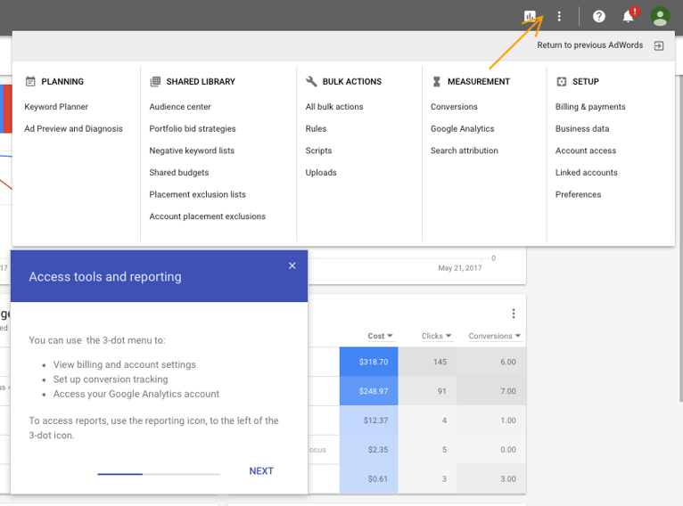
Of course you can always return to the previous interface and the system prompts that as often as you might need. There are items that will be greyed out for the time being so just be aware of what that upper right "three dot" menu allows you to do. You can also get to billing and GA directly from that menu, which is good. Reports are now universally accessible from page to page in the same are and are designated by a nice little graph icon.
Expanding the menu in the upper right, you can see that the majority of items available to you are centered around key topics like Planning, Shared Library, Bulk Actions, Measurement, and Setup. This is where you would go to get to the keyword planner, for example.
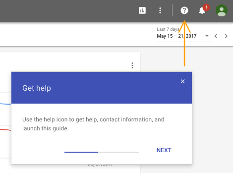
Contextual help is also universally available using the question mark icon, and the notification bell for alerts is in a familiar spot with a little more emphasis given the darker background.
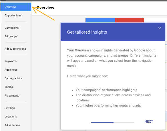
The overview portion is by far the greatest improvement, with some good insights custom curated and bubbled to the surface in visually engaging ways. Big movers and movement by device type are some great examples of these tailored insights that will likely only deepen and grow over time.
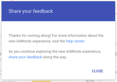
As per usual, Google also allows you to share your feedback as you navigate the new interface.
What is your experience using this new interface? Are there metrics that you are seeing that you didn't notice before? Do you find it easier to navigate? Let us know in the comments below or over social media. Also, if you feel like you are simply too overtasked to approach these tools for your organization, you might need a partner to help you navigate those waters. Drop us an email today and let us know how we can help.
Related Posts

3 Pro Tips to Make Your HubSpot Workflows Successful
HubSpot's workflows are a powerful tool for connecting with your customers. We share 3 pro tips for getting the most out of your workflows.
Why You Need an SEO Content Audit in your Migration Plan
Diagram's Allison Casey spills all her insider SEO tips on migrating your content the right way.
Results Matter.
We design creative digital solutions that grow your business, strengthen your brand and engage your audience. Our team blends creativity with insights, analytics and technology to deliver beauty, function, accessibility and most of all, ROI. Do you have a project you want to discuss?

Like what you read?
Subscribe to our blog "Diagram Views" for the latest trends in web design, inbound marketing and mobile strategy.